One Release, Many Formats: Building a Coherent Visual Identity for Independent Music
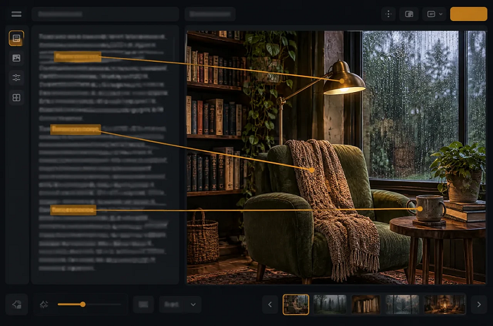
A release campaign can contain an album cover, a store banner, a tour poster, several social posts, and a merchandise preview. Each item has a different job, yet listeners should recognize them as parts of the same project. For an independent musician, the challenge is often maintaining that connection while working with limited time and a small team. A clear visual idea makes those decisions easier to share.
The useful question is not how many images a campaign can produce. It is which elements should remain recognizable when the artwork moves from a square cover to a wide banner or a small phone screen. A recurring object, a distinctive color relationship, or a particular treatment of light can create continuity without requiring every asset to be an identical crop. This gives the campaign room to adapt.
Imagine a fictional electronic EP built around the feeling of returning home after a late shift. Its visual language might combine an amber window, blue evening light, and quiet architectural shapes. This is a hypothetical creative brief, not a description of a real release. The example is useful because it provides a concrete emotional direction that can guide both imagery and the way the campaign is presented.
Before choosing a visual direction, the artist and collaborators can agree on a few words that describe the release. Those words should refer to the music and its emotional setting rather than a fashionable design trend. A slow, intimate recording may call for a different rhythm of images from an energetic live EP. The artwork does not need to describe every lyric, but it should make sense beside the sound.
Image-generation tools can help make these conversations more concrete. For example, minimax h3 image provides text-to-image and image-to-image workflows, with templates that include posters, illustrations, and merchandise concepts. An artist can use these routes to explore how a visual idea might look before committing to a campaign direction. The useful outcome is a clearer shared concept, rather than a claim that the first generated image is automatically ready for release.
Which elements should stay the same?
Choose a small set of recognizable features. In the fictional late-shift EP, the amber window could be the central motif, while the blue background establishes the atmosphere. A restrained type treatment can connect the assets even when the illustration changes. Write these decisions on a short reference sheet so that a designer, photographer, or band member can understand the intended relationship without reading a long explanation.
Also decide what is allowed to vary. The cover might show a whole building, the banner a closer view of one window, and the poster a simpler arrangement of architectural shapes. Variation keeps the campaign from feeling repetitive. The important test is whether the images still suggest the same release when viewed together. If each asset introduces a new palette and a new visual style, the connection becomes harder to maintain.
How can one idea work in different formats?
A square cover and a wide store banner offer different spaces for composition. Cropping a finished square into a banner may remove the focal point or leave an awkward area for text. Instead, think about the visual idea as a flexible scene. The central motif can remain recognizable while the surrounding space changes. A wider view might extend the evening sky or place the building toward one side.
Keep important information separate from decorative imagery where possible. Artist names, release dates, and tour details should remain easy to update in a layout editor. The background can carry the atmosphere while typography carries the practical message. This division is particularly useful when dates or venues change late in a campaign. It avoids rebuilding an entire image simply because a line of information needs correcting.
Where do reference images help?
Original sketches, photographs taken by the artist, and approved artwork can communicate details that are difficult to describe in words. A rough sketch may establish the position of the main subject, while a photograph may demonstrate the desired lighting. MiniMax H3 Image’s product page describes support for up to sixteen reference images. A focused selection with a clear purpose is more useful than collecting unrelated examples simply to fill the available slots.
For a coordinated campaign, the image-to-image route in h3 image can be explored using an approved concept as the starting reference for related scenes. The team should compare the resulting assets side by side and decide which details belong to the release identity. This is especially helpful when a motif needs to appear in several compositions. Keep a copy of the approved reference so that collaborators can see the intended direction throughout the project.
What changes when the image becomes merchandise?
A detailed cover illustration does not necessarily make an effective shirt graphic. Fine background details can distract from the main motif when viewed on fabric. A simpler version may communicate the same idea more clearly. For the fictional EP, the illuminated window could become a compact emblem, while the full building remains on the cover. The relationship is conceptual rather than a requirement to reproduce every pixel.
A mockup helps a team discuss placement, scale, and color, but it is still a proposal. Label it clearly as a concept when showing it to collaborators. Production artwork needs to follow the chosen printer’s specifications, and the actual product should be represented accurately when offered for sale. An attractive generated preview should not be treated as proof of the final fabric, ink finish, stitching, or packaging.
How much image detail is enough?
The H3 Image page lists 1K, 2K, and 4K output choices. Lower-resolution drafts can be useful while comparing compositions, while a larger output gives more room to inspect detail or make a crop. The right choice depends on the intended asset. A website preview and a physical poster have different demands, so make the decision in relation to the planned use rather than choosing the largest option automatically.
Review the final asset in context. A cover that looks compelling on a large monitor may lose its focal point as a small thumbnail. A banner may need additional space around a store heading. A poster needs a clear order of information from across a room. These checks connect the artwork to the listener’s experience and help the team notice problems that are easy to miss when considering the image alone.
What should the campaign handoff contain?
Keep the final handoff small and understandable. Include the approved motif and palette, the finished assets for each format, editable text layouts where relevant, and a short note explaining the role of any generated imagery. Use filenames that identify the asset and version. Collaborators should be able to find the current cover or banner without guessing which of several nearly identical files has been approved.
A coherent release identity does not require every asset to look identical or every visual decision to be made at once. It requires a few deliberate choices that remain visible as the campaign expands. Image tools can make alternatives easier to discuss, while the artist and collaborators decide which direction belongs with the music. When the cover, store, poster, and merchandise share that direction, the campaign becomes easier to recognize and easier to maintain.